What is a HubSpot dashboard?
HubSpot dashboards summarize key performance indicators and other useful information from HubSpot, allowing teams and stakeholders to quickly analyze and understand different aspects of their sales funnel.
Tools like Geckoboard allow for deep levels of customization, support real-time data, and allow you to add data from other sources too. In other words, there are some decisions to make around exactly which KPIs are most useful to have on there! Those decisions broadly depend on two things:
- Who the dashboard is for. Is it for motivating your sales team, giving a manager a real-time view of the state of play, or for regular high-level reporting?
- How you’ll be sharing your dashboard. For example, will it be sent to Slack as a regular wrap-up at the end of the day, made available for the team as a link, or displayed on a big screen?
Every team is different; there’s no right or wrong answer, and it’s easy enough to evolve your HubSpot dashboards over time. Below is a growing selection of example HubSpot dashboards made with Geckoboard to help get things started.
HubSpot deals dashboard
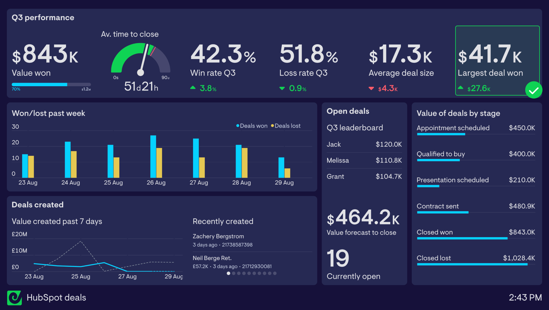
This dashboard is focused around important deal metrics and other useful information that can give a team a quick insight into how deals are progressing.
Along the top row is a series of performance data relating to how the team is performing over the quarter. KPIs like win rate, loss rate, average time to close, average deal size and largest deal won give the team a quick understanding of how they’re performing relative to the previous quarter. Placing their main goal in the top left of the dashboard - winning $1.2 million in value - is great dashboard design best practice.
In this case, ‘Largest deal won’ has been set up with a status indicator to alert the team when the largest deal of the quarter exceeds $40k - a great motivation booster.
Elsewhere on the dashboard, on the left are several charts showing how the week is progressing in real-time in terms of deals won and lost, and the value of deals created through the week. This line chart also includes a comparison with the previous 7 days, which can easily be toggled on or off.
To give everyone some more context, a feed of newly created deals sits to the right.
Rounding out the dashboard, a group of ‘Open deals’ widgets shows how many deals are currently open, the total weighted value of those forecast to closer this quarter, and a live leaderboard of who in the team currently owns deals worth the most value.
Finally, the value of deals currently at each stage sits to the right, giving a useful snapshot of the health of the team’s pipeline.
Focus area
Deals in HubSpot
Who looks at it?
Sales team, Director of Sales
How often?
Every day
- HubSpot
