Product updates

Bring 1000s of new data sources onto your dashboard through Zapier

We’re always expanding the range of data sources you can access in Geckoboard, and today we’re excited to add Zapier to the mix. With over 3000 of their own integrations, connecting Zapier to Geckoboard means you can now visualize and share interesting data from almost anywhere. (See the full range of information Zapier can pull here).

How it works

Our Zapier integration is a little different to our other integrations, and starts with an empty dataset you create in Geckoboard. You’ll then need to log in to Zapier (or create an account), and make a zap that pulls data from your chosen source and then sends it to the dataset you created. Your data can then be visualized, filtered, and aggregated in a variety of ways by clicking Datasets in your Geckoboard account.

For more detailed setup instructions, check out our setup guide!
Overhauled New Relic data source (beta)

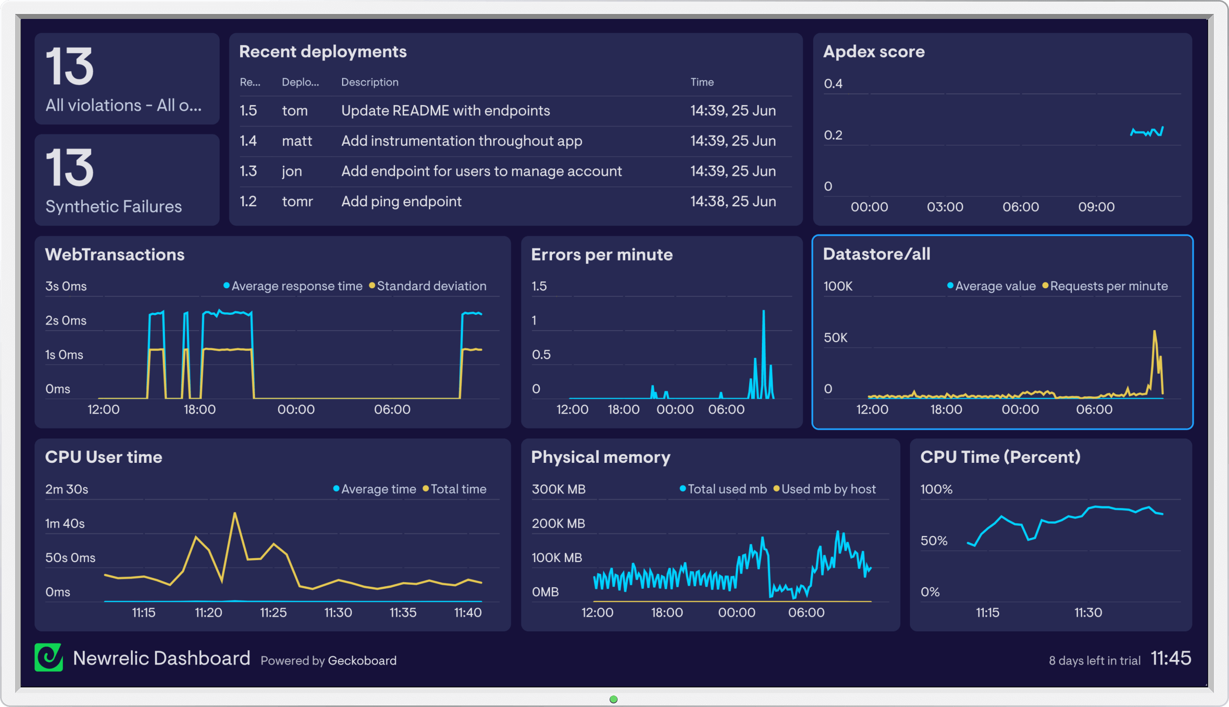
We’ve rewritten our New Relic integration from the ground up to support more metrics and improve the experience of building New Relic widgets. Currently in beta, the new integration offers:

  • Full coverage of metrics for your web and mobile applications including the ability to compare multiple metrics on one chart
  • A way to display recent deployments
  • The ability to track violations
  • Support for both US and EU data regions
  • Improved reliability

new-relic-kpi-dashboard-geckoboard-e531d8.png

Stripe data source (beta)

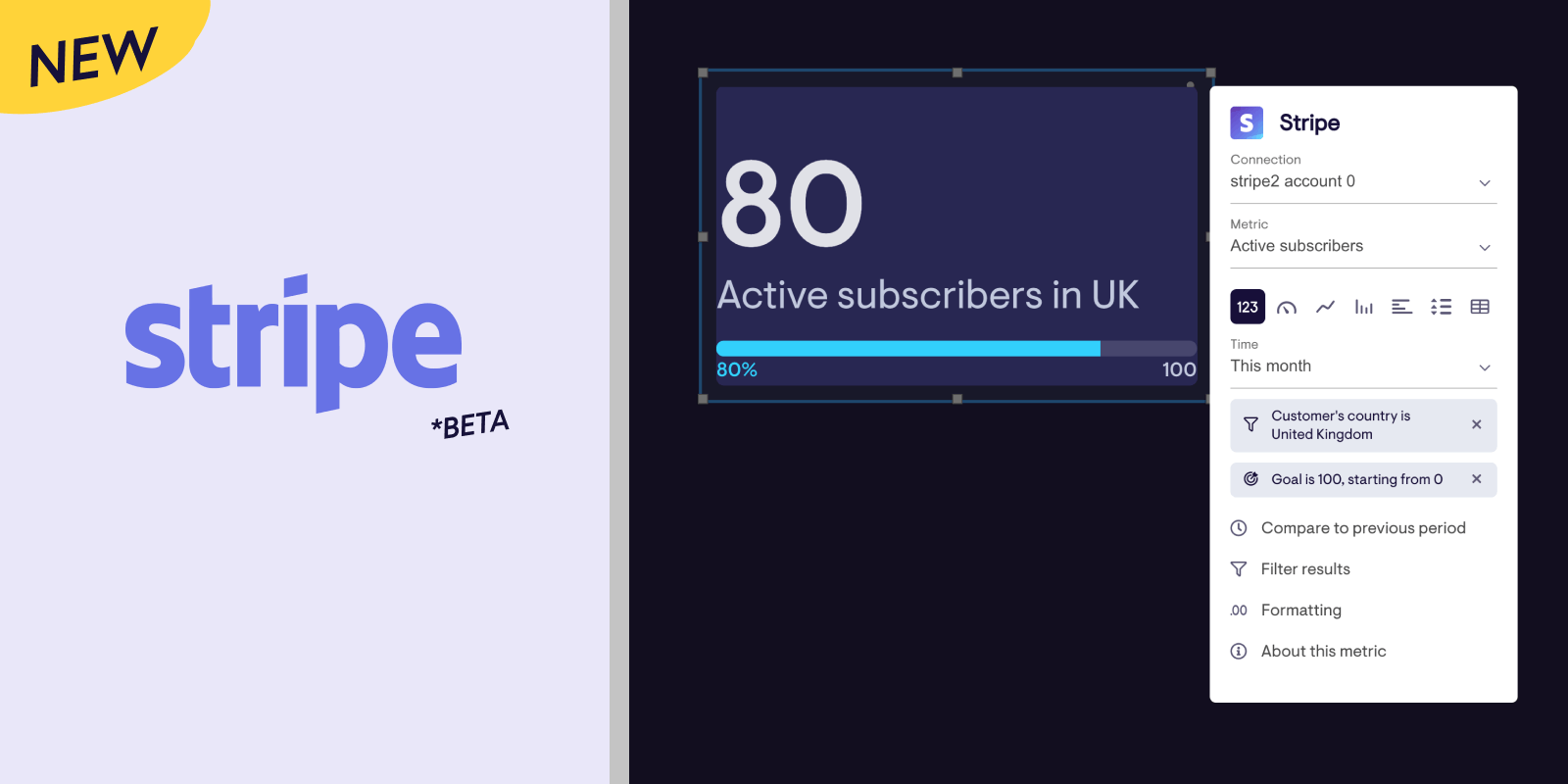
Our new Stripe data source is now available 🎉. This beta version is under active development, and currently supports subscriber metrics, enabling you to visualize things like:

  • All-time subscriber counts
  • Active vs cancelled subscribers, including trends over time
  • Trialists, including trends over time
  • Filter and split subscriber counts by plan, product or customer’s country
  • Compare active and cancelled subscribers or trialists on the same chart (i.e multiple metrics)

stripe-beta-geckoboard.png

eCommerce and Connect metrics aren’t available yet, but if you have any requests or feedback let us know!

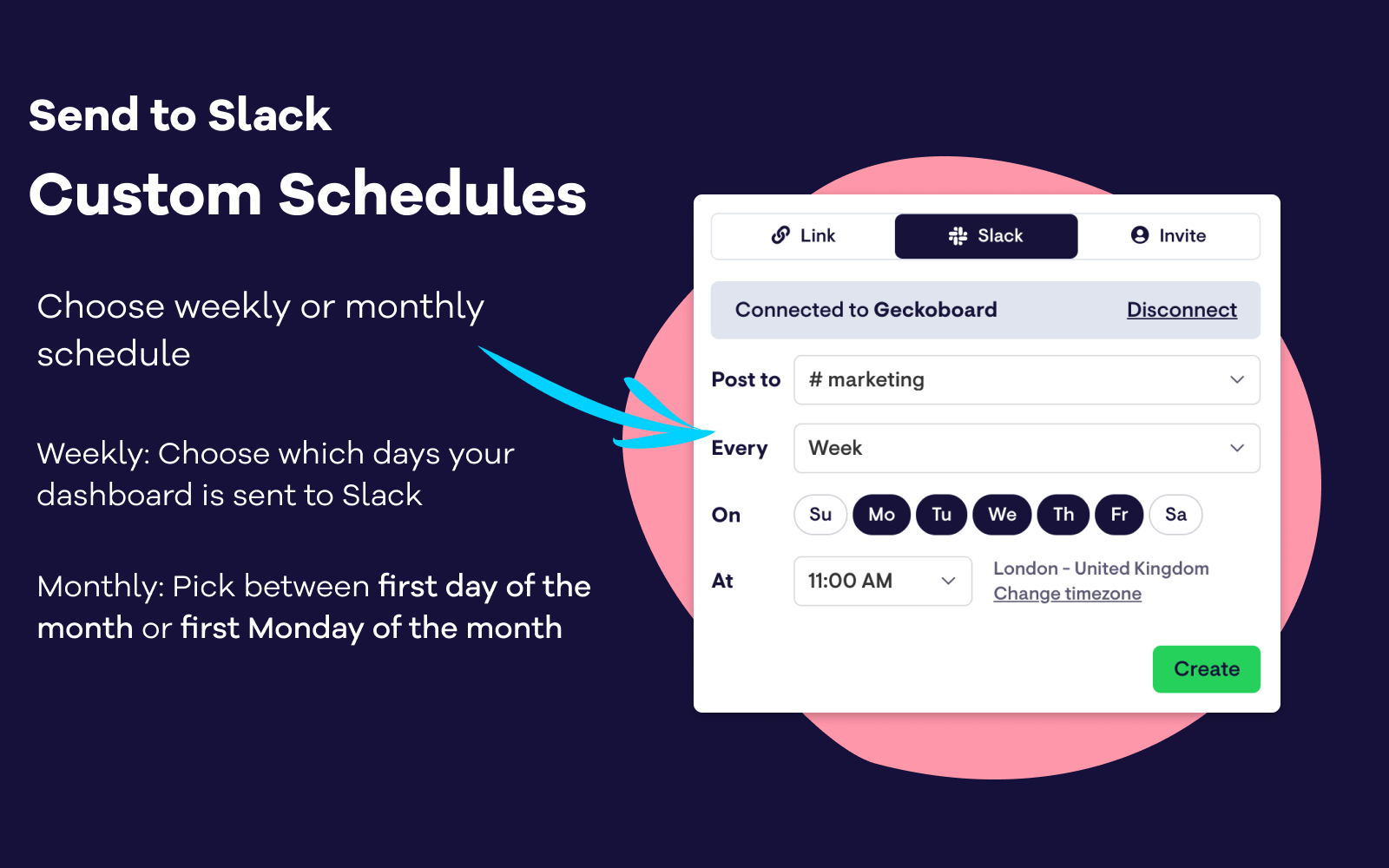
Send dashboards to Slack with a custom schedule

Our latest update to our Slack integration gives you full control over when your dashboards post to a Slack channel. Dashboards can now be set up to send to Slack on specific days of the week (for example, on weekdays Monday to Friday, or just on Tuesdays). We’ve also added the option to send dashboards on a monthly basis on the first day of the month, or the first Monday of the month.

slack-custom-schedules.png

Filters for Shopify widgets

We’ve shipped several improvements to the beta of our Shopify data source, adding powerful new ways to drill into your Shopify data:

  • Apply a whole new range of filters to your Shopify data, including billing city, discount code, order tag, order cancel reason and more.
  • Split data on your line and column charts by billing country, order tag, currency, and more.
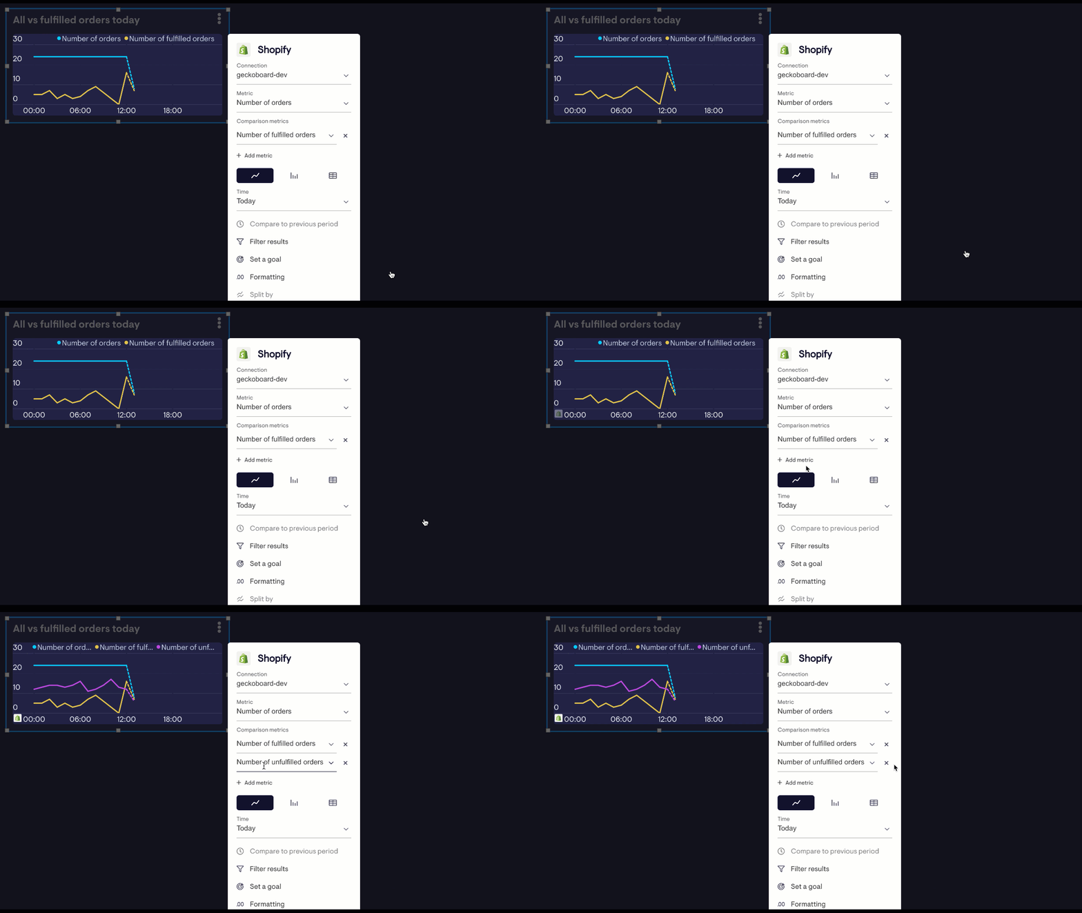
  • Compare multiple metrics of the same type on one visualization; show fulfilled, unfilled and total orders on the same line chart, for example.

comparison-metrics.gif

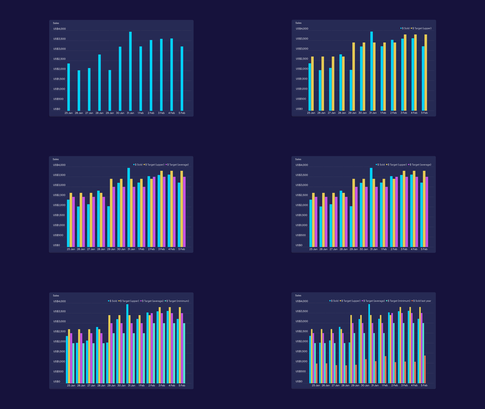
Compare up to 5 data series on column charts

You can now compare up to five series to column charts that are powered by a Spreadsheet or Custom Dataset (boosting the limit up from three series). You’ll also find it possible to add more series to visualizations that use our ‘split by’ feature, which includes Google Analytics, Zendesk and Intercom.

increased-series-limit.gif

Comparison visualizations on Shopify widgets

We’ve released an update to the beta of our Shopify data source that now lets you show how your Shopify data has changed compared with a previous time period.

The beta of our new Shopify data source now lets you show how your Shopify data has changed over time. You’ll now find comparisons available on line charts and number widgets, that let you compare hourly, daily, weekly and monthly data, depending on how you’ve set your widget up.

shopify-comparison-viz.png

Note: We limit the amount of historical data we import from Shopify, so comparisons can be applied only to timespans that cover the 31 days before you connected your Shopify account to Geckoboard onwards.

Number and line widgets for visualizing AppFigures Sales

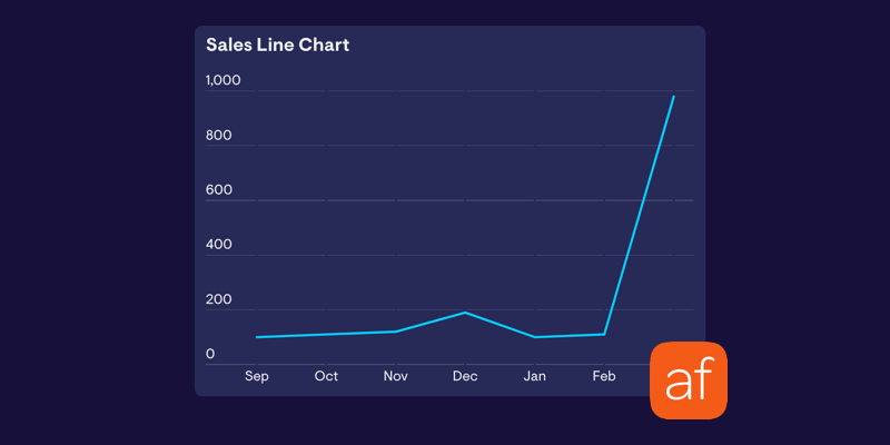
We’ve rebuilt our AppFigures number and line widgets to make it possible to show data from Android and iOS apps on the same widget. We’ve also tidied up the time periods you can filter your metrics by, and the updated widgets also benefit from recent visual updates we’ve made across the board.

appfigures-update.png

Switch widget orientation in a group

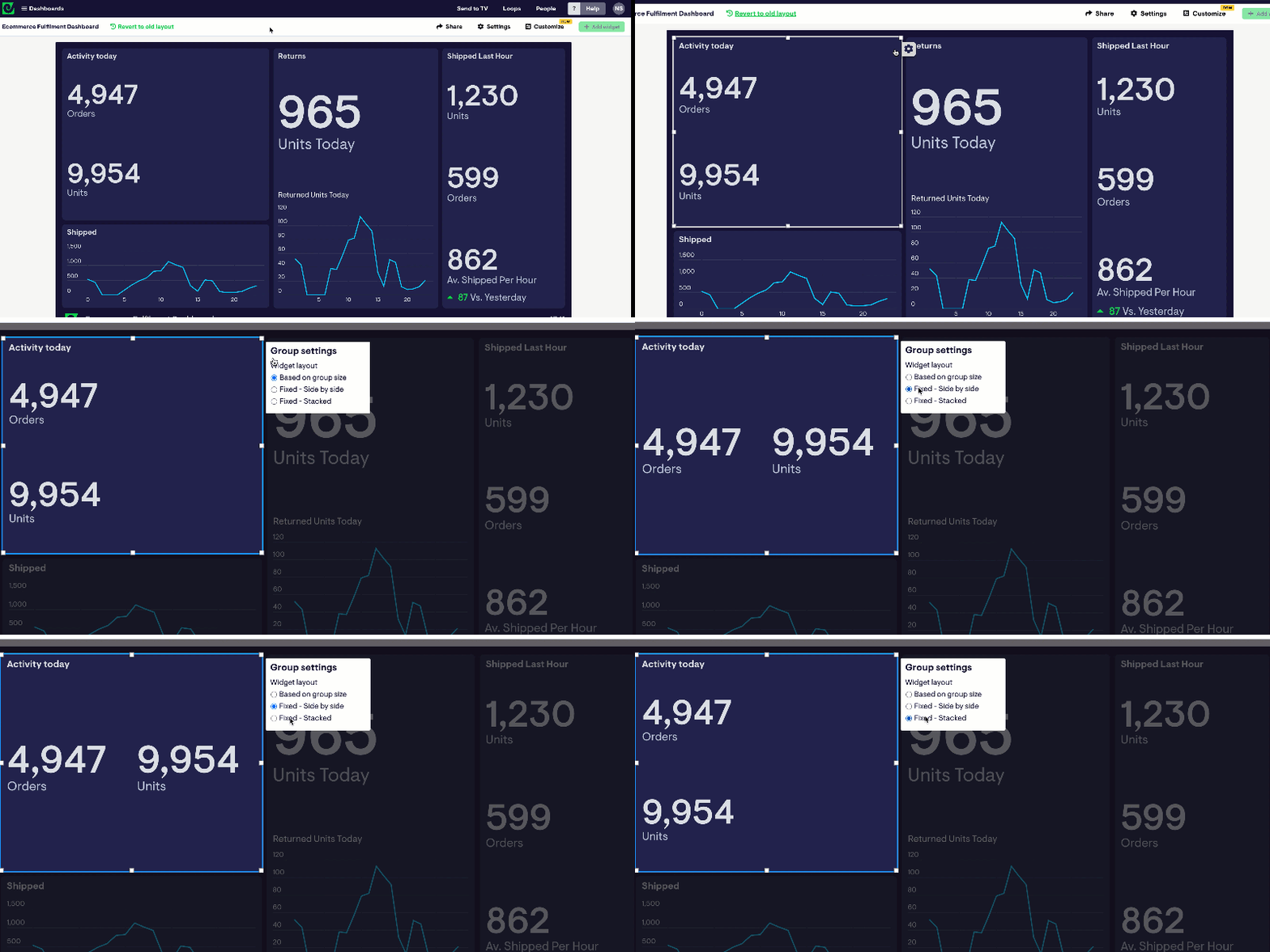
When grouping widgets, widgets within a group will position themselves based on the space available. Now we’re giving you more control over whether widgets stack vertically on top of each other, or horizontally side by-side.

The next time you’re building a dashboard, you can quickly and easily switch the orientation of widgets by hovering over the group, clicking the cog icon that appears in the top right of the group ⚙, and picking an option that works best for the dashboard you’re working on.

switch-widget-orientation.gif